© Crown copyright. All rights reserved. Department for Transport 100020237 2006
Rachel Thomas' article from Plus magazine.
© Crown copyright. All rights reserved.
Department for Transport 100020237 2006
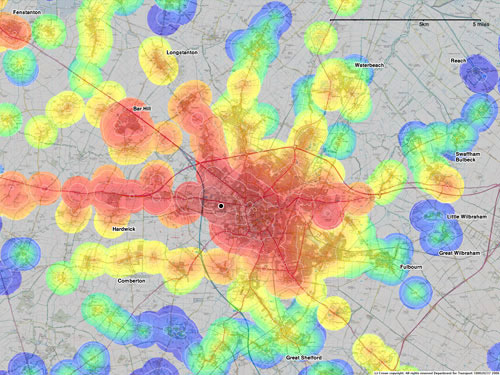
This is an example of the influential travel-time maps produced by mySociety, in work funded by the Department for Transport. The maps show how the data put together for TransportDirect, a real-time information service, can be used for other purposes, for example to help employers site a new facility, or individuals choose where to live, or to inform the planning of transport and land use.
Clearly the travel-time for a particular journey is a function of the origin and destination points, the time of travel, the modes used, and of decisions made by the traveller (for instance whether to prefer faster or cheaper journeys). Our travel-time maps can only conveniently display a function of one point (the origin or destination point), so we need to fix the other arguments so that it describes journey times which are useful to users in some context, and it is practical to compute.
TransportDirect has a set of databases of timetable information and how public transport services connect up. We feed very large numbers of queries into the journey planner at TransportDirect (approximately 30,000) and use these to form an estimate of the travel time. For maps such as the one above, we fix the destination and arrival deadline and iterate over all the transport interchanges in the region of interest to compute the latest departure necessary to arrive before the deadline.
Now we have enough information to draw the map. We iterate over a grid of points in the region of interest (choosing the spacing by the resolution of the map to be drawn); at each point we search for transport interchanges within 15 minutes' walking distance of that point, and choose the one which gives the shortest overall journey time, if any. This generates a grid of points at which we know the journey time, or know that no journey is possible. From this it is trivial to draw a map where each point is coloured according to journey time, or uncoloured if no journey is possible. We choose the colours according to a standard scale, but adjust the colours using histogram equalisation so that each colour covers approximately the same area of map.
The contours, or isochrones, are essential to making the map comprehensible. Drawing these is slightly more subtle, because the function to contour (the travel-time) is not actually defined everywhere in the region of interest. We fix this up by extrapolating the values of the travel time outside the domain of the function, contouring the extrapolated function, and then clipping the contours against the domain of the function. Our extrapolation is a solution to Laplace's equation, fixing its value to the value of the travel-time on the boundary of its domain, and fixing the normal derivative at zero on the boundary of the region of interest. Though there is no real justification for this approach it produces acceptable results.
The map above shows the travel-time from locations in Cambridge and the surrounding villages to reach west Cambridge (the small black circle near the centre) by 9am. The contour lines are drawn at intervals of 10 minutes, so that the innermost contour around the destination corresponds to a start time of about ten to nine.
Cambridge is a small city with a lot of bus services, so it is not very surprising that the whole of the city centre and much of the suburbs are within twenty to thirty minutes' travel of the destination, even including waiting and walking time. Moving further out, though, the picture changes. Areas connected to Cambridge by fast roads such as the A14 fare much better than those villages off the beaten track. For some habitations (such as Rampton, to the north-east of Longstanton, in an uncoloured area of the map) it is not possible to reach the West Cambridge Site for 9 o'clock purely by public transport without a long walk or an overnight journey.
The hope is that the travel-time maps can offer people an easy way to make decisions about where to live, and work, and travel to, that may encourage the use of the public transport system. Other travel-time maps also compare travel by car to public transport, and future work may link transport to house prices and to indicators of social deprivation.
Isochrones were first calculated by Francis Galton in the 19th century, in an early application of dynamic programming to the determination of routes for sailing boats. The major issues in more recent years have concerned the organisation of, and access to, data of fine granularity in space and time. An underlying purpose of the work described here is to tackle the question of access to data. mySociety's maps were produced under the auspices of the Department for Transport, so they did not have to pay for the use of expensive datasets such as postcodes and the Ordnance Survey maps. The work has raised questions about who owns the data, who can access it and how easily it can be interchanged and the maps reproduced.
The travel-time maps are more than just pretty to look at; they also demonstrate an innovative way to use and present existing data. We are entering a world where we have access to vast quantities of data, and ways of turning that data into information, often involving clever ideas about visualisation, are becoming more and more important in science, government and our daily lives.
Frank Kelly is in the Statistical Laboratory in DPMMS, and has just finished a three year term as Chief Scientific Adviser to the Department for Transport. Some wider issues of transport data and innovation are addressed in a recent article.